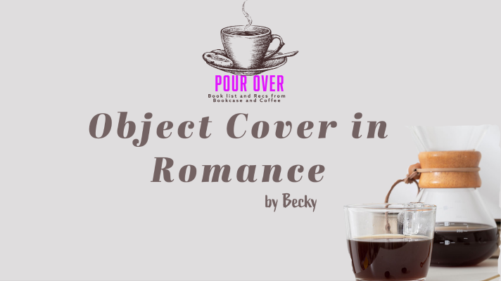
Object Cover in Romance
I have for a long time been fascinated by the covers on romance novels. One that I am not sure on if I like is the Object Cover.
As I have been doing my deep dive into the History of the romance book cover and dissecting the latest trends in the covers, I have been spending a lot of time thinking about the Object Cover.
Object Covers are on the upswing of popularity after years of the Man Cover. Object Covers in the last year have been referred to as discreet or muted covers.
In romance books, an object cover refers to a cover design that features an object or a thing instead of people or characters. This type of cover design is often used for romance novels that focus more on a particular object or item that is significant to the story, rather than the characters themselves.
Object covers can be quite effective in capturing the attention of potential readers, as they can convey a sense of mystery or intrigue about the story. For example, an object cover featuring a key, or a locket might suggest that the story is centered around a secret or a mystery that the characters must uncover. Object covers can also be used to convey a particular mood or theme of the story.
Not all Object Covers are great.
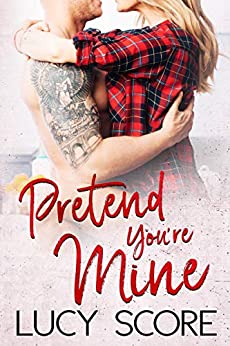
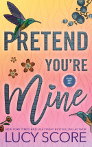
One of the current shortcomings of Object Covers is when the chosen object is not relevant to the story. This issue has been observed in the recent covers of “The Benevolence” book series by Lucy Score, which are being republished and covered by Bloom Books Publishing. The first two covers depict dragonflies and hummingbirds, despite no mention or relevance of these creatures in the books. As a result, these covers fail to capture the romantic and small-town protector themes that are integral to the story.
Some Object Cover are done perfectly.
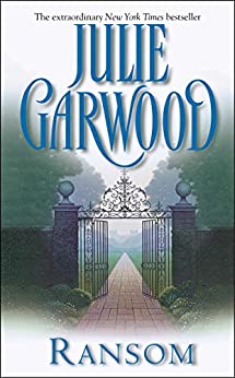
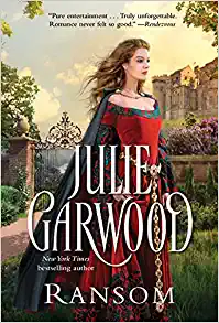
An excellent illustration of an effective use of an object on a cover is seen in Julie Garwood’s novel Ransom. The original cover features a gate that leads to a stone walkway shrouded in fog or mist. The step-back version offers a glimpse of the grand manor located behind the gate. More recently, the book was reissued with a cover that portrays a woman in medieval attire, with the mist and fog still enveloping the gate and the manor visible in the distance. These covers successfully capture the essence and time period of the story and establish a clear link with each other through the gate’s presence.
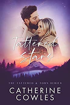
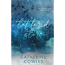
I am torn about Catherine Cowles’ selections for the covers of her Tattered and Torn Series. Although I appreciate the Object Covers’ resemblance to the character covers, I believe that the color coordination could have been improved. I would have preferred to see a reciprocal design in the identical color scheme.
Overall, object covers can be a powerful tool for romance authors and publishers to draw readers in and convey the essence of their stories in a visually compelling way. It just needs to be done in a way that works to enhance the story and engages a reader.
You can listen to our episode all about Romance Covers here.